What is GNOME’s Philosophy?
I am not speaking on the behalf of GNOME.
Table of Contents
Introduction§
GNOME’s philosophy is sophisticated and there is a lot of room for forgetting important information, as design and user experience are, in my opinion, really difficult to understand, while being really easy to misunderstand as well.
For starters, I will explain the key focus of GNOME. Then, I will be explaining and elaborating on how GNOME approaches it. I will also share my opinion on that matter.
Wikipedia’s Definition§
To quote from Wikipedia:
[P]roductivity has been a key focus for GNOME. […] [T]he design of the GNOME [graphical user interface (GUI)] is guided by concepts described in the GNOME [Human Interface Guidelines (HIG)], itself relying on insights from cognitive ergonomics. Following the HIG, developers can create high-quality, consistent, and usable GUI programs, as it addresses everything from GUI design to recommended pixel-based layout of widgets.
[…]
GNOME aims to make and keep the desktop environment physically and cognitively ergonomic for people with disabilities. The GNOME HIG tries to take this into account as far as possible […]
To reiterate this snippet, I’m going to break down into a list of key factors that make up GNOME’s philosophy and elaborate on each of them, and hope that it gives a more thorough insight on GNOME’s philosophy.
Productivity§
As explained on Wikipedia, productivity is the focal point of GNOME. Productivity, in computer terminology, means that the software is designed to be efficient; to get work done. However, whether something is productive or not for a specific person or use case is entirely subjective. For example, GNOME is not designed for tinkerers, gamers and power users, so applications targeted for GNOME may likely be unsuitable for those range of users and use cases. On the other hand, GNOME targets a specific audience and attempts to make it efficient for them, in a peculiar way.
Target Audience§
GNOME’s target audience is people with disabilities. Even though it’s not written in the Wikipedia article, I would also say that the average computer and mobile user is part of the target audience, because many of GNOME’s default settings are targeted for them. I will be referring them as “user(s)” thereafter.
I would also claim that developers interested in GNOME are part of the target audience. Recently, there have been many initiatives that made GNOME more fun and convenient for developers, for example libadwaita, GNOME Circle, Blueprint, and This Week in GNOME. GNOME also participates in programs that facilitate participating in FOSS, such as Google Summer of Code and Outreachy.
To clarify, I will not be referring developers as users.
Coherence§
One of GNOME’s goals is to provide a coherent ecosystem for users and developers. This means, everything made for GNOME should ideally feel like they belong in GNOME.
The GNOME Human Interface Guidelines (HIG) are guidelines for developers to follow while developing their own application. The HIG guides them to use the right widgets, grammar, etc. and guides them into making a more accessible application. This leads to a uniform set of applications that aid users familiarize with GNOME, while also taking a step forward on accessibility and responsiveness.
Peacefulness and Organization§
Another thing that wasn’t mentioned in the Wikipedia article and is almost never discussed, in my opinion, is a peaceful and organized interface. GNOME aims to achieve this by discouraging some (sometimes conventional) features that often lead to clutter and distractions, such as desktop icons and the dock/taskbar.
Another example is heavily focusing the workflow around workspaces (commonly known as virtual desktops). Workspaces are useful for organizing windows, especially when they are treated as a first-class feature.
For example, I use the first workspace for browsing, the second workspace for development and writing articles, the third workspace for chat applications, the fourth workspace for emails, and finally the fifth workspace for everything else. This makes it really easy for me to navigate through applications by switching workspaces, as I have the order memorized, with everything cleanly separated.
Cognitive Ergonomics§
“Cognitive ergonomics is concerned with mental processes, such as perception, memory, reasoning, and motor response […]“(Source) Cognitive is the process of learning something. Ergonomics is understanding how humans interact with the system. I will be explaining those mental processes, as well.
Note: This will be an oversimplified explanation of those mental processes; this may be inaccurate, as peak accuracy is not the priority.
Perception§
Perception is ensuring that the information is legible for the user, and that it triggers as few conditions as possible (forgetting, disorientation, etc.).(Source)
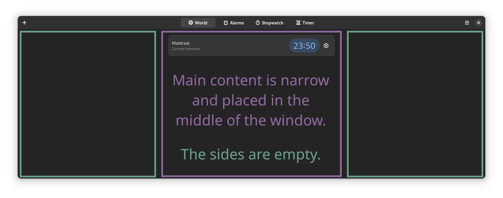
For example, GNOME applications focus on narrowing elements (text, buttons, etc.) and placing important elements relative to the middle of the window. Narrowing text is crucial to readability, as wide lines of text can increase the reading difficulty, because this makes it more difficult to track lines of text:(Source)

The main content (body) is narrow and placed in the middle of the application, despite having a lot of whitespace to the sides.
Memory§
Memory is ensuring that the information displayed to the user is easy to remember. Using complicated terminologies and/or overexplaining something can contribute to forgetting certain or all pieces of information described. Typically, being clear, concise, and using familiar terminologies can help the user remember information.(Source)
Reasoning§
“Reasoning is the process by which we use the knowledge we have to draw conclusions or infer something new about the domain of interest.”(Source) One such example of making something reasonable is by using common sense and/or familiar terminologies to explain a more complex topic.
Motor Response§
In the context of user experience, motor response is “[a]ny action taken by the user in response to their environment (e.g., the visual presentation of a design) and the cognitive processing they perform.”(Source) Cognitive processing is the procedure for comprehending the environment.
Some kinds of hints often help the user predict an action. Let’s take clicking on a button for example. Whenever the cursor hovers over a button, the button ‘highlights’, to indicate that it is being hovered. This helps the user predict that left-clicking (or tapping) will trigger this button and perform an action.
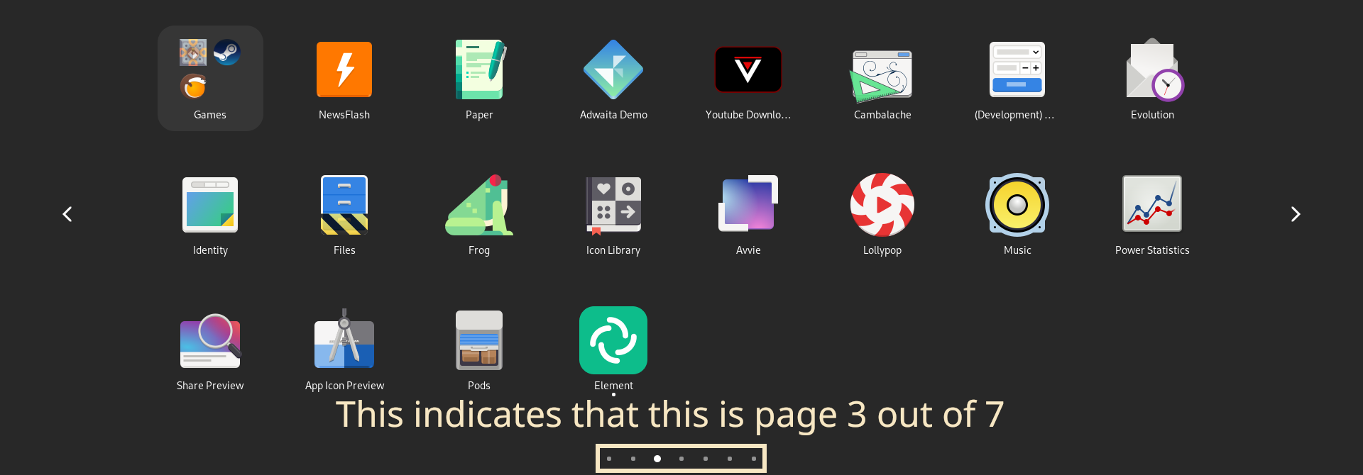
Indicators help users understand where they are and predict where they will go after an action, which helps them act on it as well. For example, in the App Grid, a page indicator designates the page the user is on. The user can then infer the direction they’d want to go to (whether they should go to the previous page or next page), depending on the situation:

At the bottom middle of the App Grid, each page indicates a small circle. The highlighted circle, which is white and larger than the rest, indicates the page I am on. In this image, I am on page 3 out of 7.
On the first page, the user knows that there is no previous page, so they naturally go to the next page if they are aware of the current page. Likewise, the user only goes to the previous page when they are on the last page.
Conclusion§
To summarize GNOME’s philosophy, its primary focus is productivity. To achieve this, GNOME targets a specific audience, namely people with disabilities, average computer and mobile users, and developers interested in GNOME. GNOME takes a step to provide a coherent, peaceful and organized workflow and ecosystem, relying on insights from cognitive ergonomics.
As said at the beginning, GNOME’s philosophy is sophisticated, as the whole workflow is focused around productivity, with a unique approach. Hopefully, this gives you a better insight on GNOME’s high level goal, and how it approaches it.