Rewriting nouveau’s Website
Table of Contents
Introduction§
We spent a whole week rewriting nouveau’s website — the drivers for NVIDIA cards. It started as a one-person effort, but it led to a few people helping me out. We addressed several issues in the nouveau website and improved it a lot. The redesign is live on nouveau.freedesktop.org.
In this article, we’ll go over the problems with the old site and the work we’ve done to fix them.
Problems With Old Website§
I’m going to use this archive as a reference for the old site.
The biggest problem with the old site was that the HTML and CSS were written 15 years ago and have never been updated since. So in 2023, we were relying on outdated HTML/CSS code. Obviously, this was no fun from a reader’s perspective. With the technical debt and lack of interest, we were suffering from several problems. The only good thing about the old site was that it didn’t use JavaScript, which I wanted to keep for the rewrite.
Fun fact: the template was so old that it could be built for browsers that don’t support HTML5!
Not Responsive§
“Responsive design” in web design means making the website accessible on a variety of screen sizes. In practice, a website should adapt to work on mobile devices, tablets, and laptops/computer monitors.
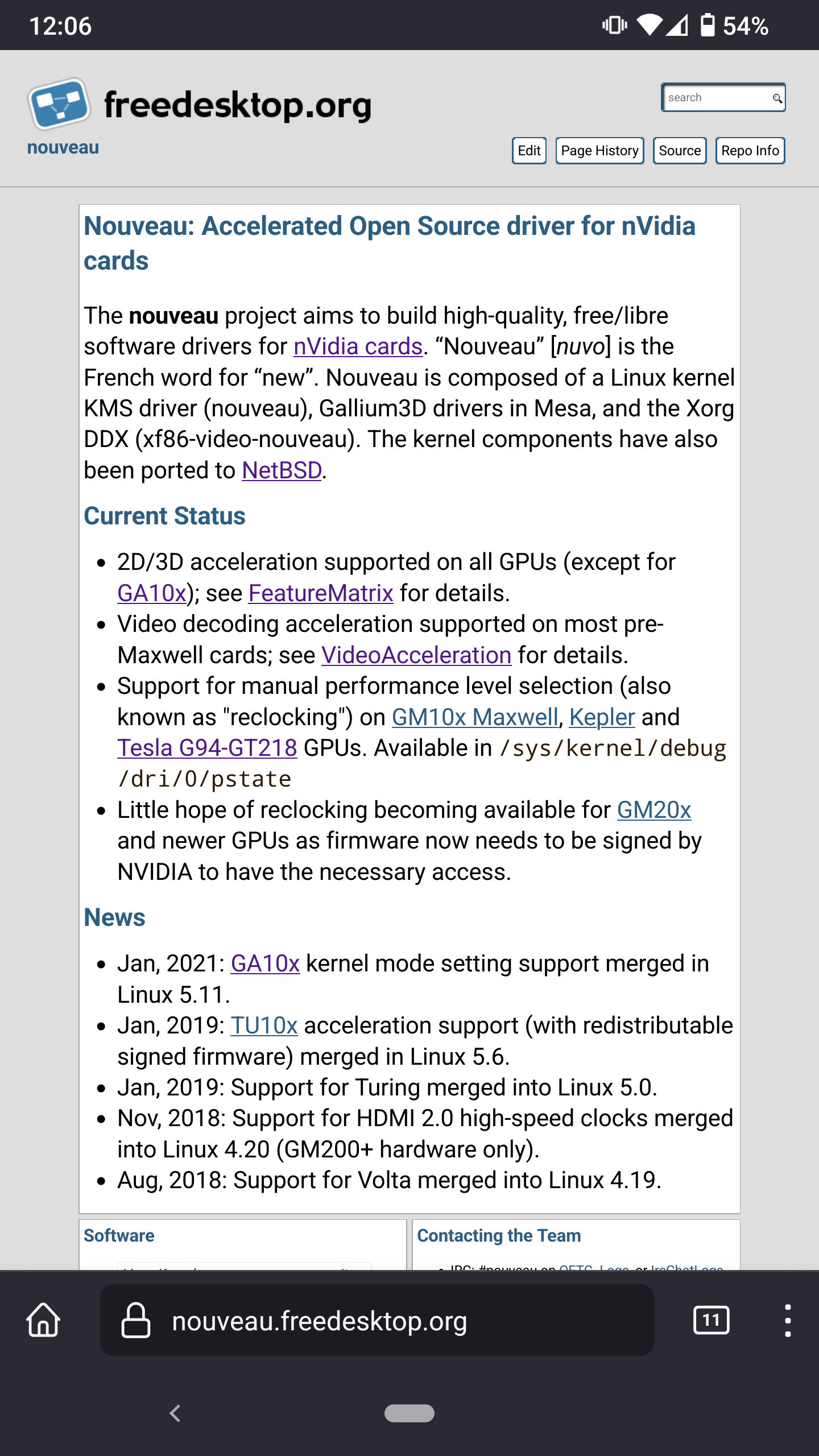
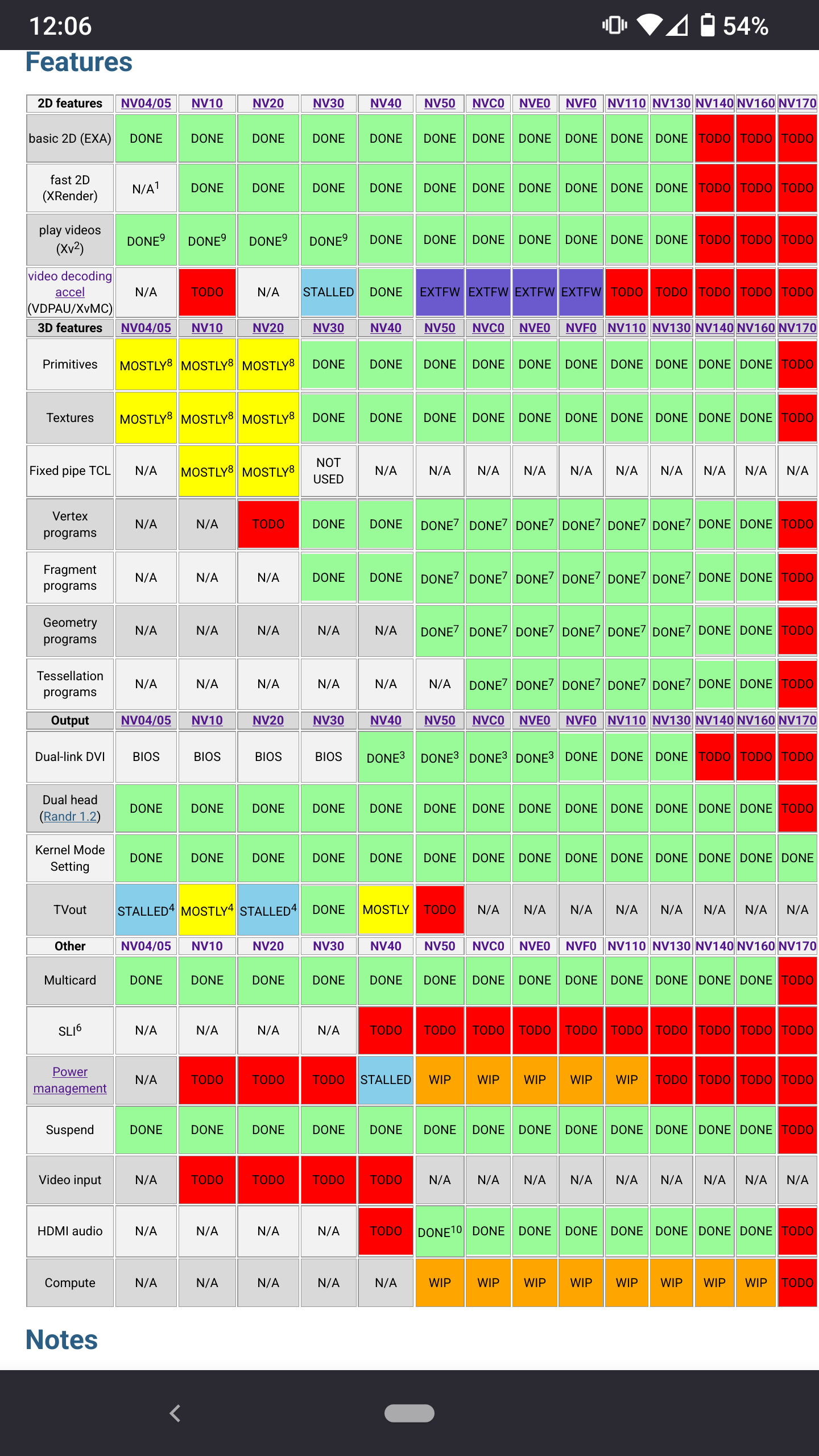
In the case of the nouveau website, it didn’t support mobile screen sizes properly. Buttons were hard to tap and text was small. Here are some screenshots taken in Firefox on my Razer Phone 2:

Small buttons and text in the navigation bar that are difficult to read and tap.

Small text in a table that forces the reader to zoom in.
No Dark Style§
Regardless of style preferences, having a dark style/theme can help people who are sensitive to light and battery life on AMOLED displays. Dark styles are useful for those who absolutely need them.
No SEO§
Search Engine Optimization (SEO) is the process of making a website more discoverable on search engines like Google. We use various elements such as title, description, icon, etc. to increase the ranking in search engines.
In the case of nouveau, there were no SEO efforts. If we look at the old nouveau homepage’s <head> element, we get the following:
<head>
<meta charset="utf-8">
<title>nouveau</title>
<link rel="stylesheet" href="style.css" type="text/css">
<link rel="stylesheet" href="xorg.css" type="text/css">
<link rel="stylesheet" href="local.css" type="text/css">
<link rel="alternate" type="application/x-wiki" title="Edit this page" href="https://gitlab.freedesktop.org/nouveau/wiki/-/edit/main/sources/index.mdwn">
</head>
The only thing there was a title, which is, obviously, far from desirable. The rest were CSS stylesheets, wiki source link, and character set.
Readability Issues§
One of the biggest problems with nouveau’s website (apart from the homepage) is the lack of a maximum width. Large paragraphs stretch across the screen, making it difficult to read.
Process of Rewriting§
Before I started the redesign, I talked to Karol Herbst, one of the nouveau maintainers. He had been wanting to redesign the nouveau site for ages, so I asked myself, “How hard can it be?” Well… mistakes were made.
The first step was to look at the repository and learn about the tools freedesktop.org uses for their website. freedesktop.org uses ikiwiki to generate the wiki. Problem is: it’s slow and really annoying to work with. The first thing I did was create a Fedora toolbox container. I installed the ikiwiki package to generate the website locally.
The second step was to rewrite the CSS and HTML template. I took a look at page.tmpl — the boilerplate. While looking at it, I discovered another problem: the template is unreadable. So I worked on that as well.
I ported to modern HTML elements, like <nav> for the navigation bar, <main> for the main content, and <footer> for the footer.
The third step was to rewrite the CSS. In the <head> tag above, we can see that the site pulls CSS from many sources: style.css, xorg.css, and local.css. So what I did was to delete xorg.css and local.css, delete the contents of style.css, and rewrite it from scratch. I copied a few things from libadwaita, namely its buttons and colors.
And behold… merge request !29!
Despite the success of the rewrite, I ran into a few roadblocks. I couldn’t figure out how to make the freedesktop.org logo dark style. Luckily, my friend kramo helped me out by providing an SVG file of the logo that adapts to dark style, based on Wikipedia’s. They also adjusted the style of the website to make it look nicer.
I also couldn’t figure out what to do with the tables because the colors were low contrast. Also, the large table on the Feature Matrix page was limited in maximum width, which would make it uncomfortable on large monitors. Lea from Fyra Labs helped with the tables and fixed the problems. She also adjusted the style.
After that, the rewrite was mostly done. Some reviewers came along and suggested some changes. Karol wanted the rewrite so badly that he opened a poll asking if he should merge it. It was an overwhelming yes, so… it got merged!
Conclusion§
As Karol, puts it:

“check out the nouveau repo, then cry, then reconsider your life choices”
In all seriousness, I’ve had a great time working on it. While this is the nouveau site in particular, I plan to eventually rewrite the entire freedesktop.org site. However, I started with nouveau because it was hosted on GitLab. Meanwhile, other sites/pages are hosted on freedesktop.org’s cgit instance, which were largely inaccessible for me to contribute to.
Ideally, we’d like to move from ikiwiki to something more modern, like a framework or a better generator, but we’ll have to see who’s willing to work on it and maintain it.